A Gallery Layout Example
Desoto Boulevard, Palm Harbor,Florida
How to create a grid layout with pills.css

The pills.css grid layout is based on 12 columns. 12 columns cover 100% of the webpage width. You can create a div block with any width from one column to 12 columns.
What you should understand is that when you create a few blocks, each less than 12 columns wide, the sum of the width of these blocks must be 12 columns or 100%.
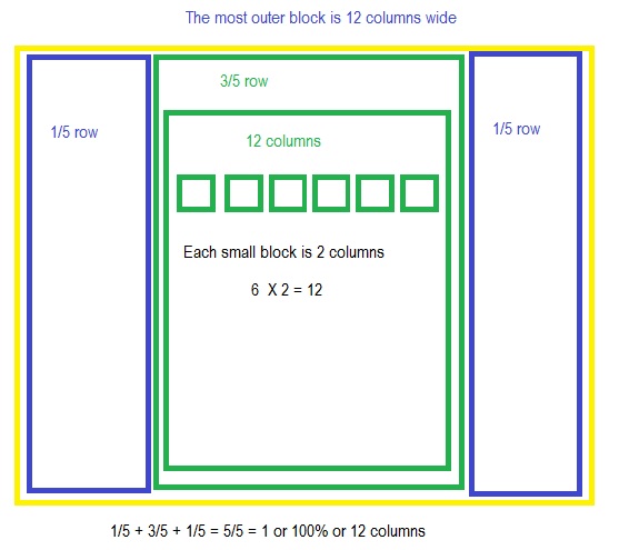
On the figure on the left, the most outer block is 12 columns. Inside this block, we have 3 blocks: one block is 1/5 of the whole row, one block is 3/5 of the whole row and one block is 1/5 of the whole row. The whole row is 12 columns.
1/5 + 3/5 + 1/5 = 1 or 100% or the whole 12 columns row.
Inside the 3/5 block we have to place 6 small blocks with images.
It is very important to understand that we cannot place these 6 small blocks directly inside the 3/5 block. First, we must place inside that 3/5 block the whole 12 columns block and only then we can place 6 small blocks inside that whole block.
To make each image responsive, we assign its width to 98% of the small block.
Download a completed source code (HTML, CSS, JavaScript and PHP) for this website.
Subscribe to our code examples

Create your website - instantly!
- Home page with a fixed background image.
- The user registration PHP code.
- MySQL database